Color is the universal language of design, and nowhere is this more evident than when working with skin colour palettes in your creative projects. Whether you’re designing websites, creating illustrations, or developing brand identities, understanding how to effectively use skin tones can make or break your visual communication. The right palette doesn’t just look good—it represents inclusivity, cultural awareness, and thoughtful design that connects with diverse audiences. Let’s explore how you can select and implement skin tone palettes that elevate your designs from basic to breathtaking.
Why Skin Colour Diversity Matters in Design
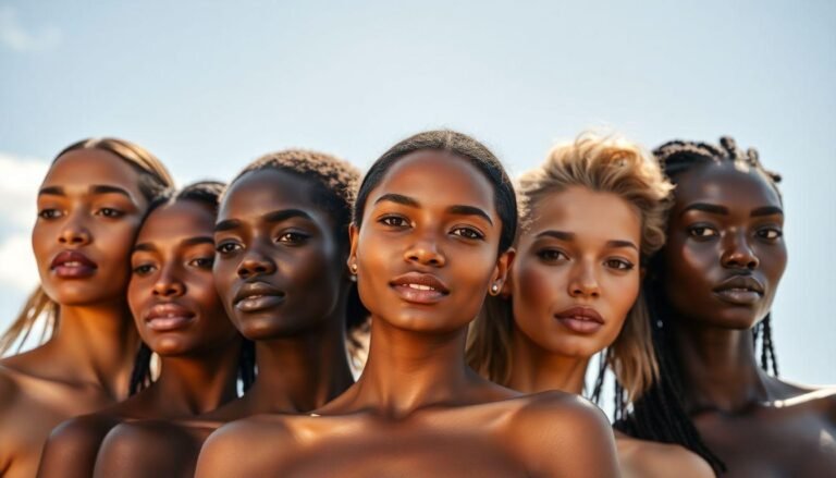
Design isn’t just about aesthetics—it’s about representation. When we limit ourselves to a narrow range of skin tones, we inadvertently exclude large portions of our audience. Inclusive design considers the full spectrum of human diversity, making viewers feel seen and valued.
The benefits of incorporating diverse skin tones include:
Recent studies have shown that consumers are more likely to engage with brands that showcase diversity in their visual content. This isn’t just good ethics—it’s good business.
Understanding Undertones in Skin Colour Palettes
Before diving into specific palettes, it’s crucial to understand the concept of undertones. Every skin color has underlying hues that can be broadly categorized as:
Cool Undertones
Skin with cool undertones has hints of blue, pink, or red beneath the surface. In your designs, these tones pair beautifully with jewel colors like emerald, sapphire, and royal purple. When creating shadowing for cool-toned skin, avoid yellow-based browns which can make the composition appear muddy.
Warm Undertones
Warm undertones showcase golden, yellow, or peachy notes. These skin tones harmonize with earth tones, terracottas, and warm greens. When highlighting warm-toned skin, consider gold-tinged lighting effects rather than silver or blue-based highlights.
Neutral Undertones
Some skin tones have a beautiful balance of both cool and warm undertones. This versatility allows for greater flexibility in color pairings and can serve as a wonderful middle ground in designs featuring multiple skin tones.
Essential Skin Tone Palettes for Various Design Contexts
Now let’s explore some specific skin colour palettes that work exceptionally well in different design scenarios:
Digital Illustration Palettes
For digital artists, having a go-to set of skin tones is essential. Consider these versatile options:
Remember that lighting conditions in your illustration will dramatically affect how skin tones appear. Create separate palettes for warm lighting (sunset, candlelight) and cool lighting (moonlight, fluorescent) scenarios.
UI/UX Design Skin Tone Considerations
When designing user interfaces that include avatars or human representations:
Some of the most successful apps and websites now include skin tone selectors for emojis and avatars, showing the growing importance of personalization in digital spaces.
Photography and Video Color Grading
For those working with photography or video:
Professional photographers often create custom camera profiles specifically calibrated for accurate skin tone reproduction across diverse models.
Tools and Resources for Working with Skin Colour Palettes
Thankfully, designers don’t have to start from scratch when working with skin tones. Several excellent resources can help:
Digital Color Libraries
Accessibility Tools
Common Mistakes to Avoid
Even experienced designers sometimes fall into traps when working with skin tones:
Perhaps the biggest mistake is treating skin tones as an afterthought rather than a central consideration in your design process.
Creating Your Own Custom Skin Colour Palette
While pre-made palettes are helpful starting points, creating custom palettes tailored to your specific project yields the best results. Consider these steps:
The most compelling designs often feature skin tones that have been thoughtfully curated rather than simply borrowed from standard collections.
Conclusion
Creating stunning designs with skin colour palettes isn’t just about aesthetic appeal—it’s about crafting inclusive visual experiences that resonate with diverse audiences. By understanding undertones, building comprehensive palettes, and avoiding common pitfalls, you’ll elevate your design work to new heights of both beauty and meaningful representation. Remember that thoughtful inclusion of various skin tones isn’t just a trend—it’s an essential component of modern, responsible design that connects with people on a deeper level. As you apply these principles to your next project, you’ll not only create more visually compelling work but also contribute to a more inclusive visual culture.