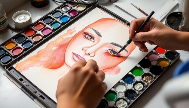
Capturing the perfect flesh tones in watercolor can be a delightful challenge that often leaves artists scratching their heads. Whether you’re painting portraits, figure studies, or simply adding human elements to your landscapes, understanding how to mix skin color paint in watercolor is an essential skill. The beauty of watercolor lies in its transparency and subtlety, which makes it perfect for creating the luminous quality of human skin. Unlike other mediums, watercolor allows light to bounce off the paper and through the paint layers, creating that lifelike glow that makes portraits come alive. Let’s explore how you can master this fundamental aspect of watercolor painting with simple techniques and materials you likely already have in your palette.
Understanding the Basics of Skin Tones
Before diving into mixing colors, it’s important to understand that there’s no single “skin color.” Human skin encompasses an incredible range of hues across different ethnicities, lighting conditions, and even within the same person. The key to realistic skin tones isn’t finding one perfect formula but understanding the underlying principles.
Skin tones generally contain three primary components:
Remember that skin is translucent, with blood vessels, muscles, and bones influencing the surface color. This complexity is what makes painting skin both challenging and rewarding.
Essential Colors for Your Palette
While you can create skin tones with just the primary colors, having a few specific pigments will make the process much easier. Here’s a suggested palette:
Basic Colors
Additional Helpful Colors
You don’t need to buy expensive specialized skin tone sets. Most artists find greater success mixing their own colors, as this allows for more control and understanding of color theory.
Basic Mixing Recipes for Various Skin Tones
Let’s break down some starting points for different skin tone ranges. Remember, these are just foundations—you’ll want to adjust based on your specific subject.
Fair/Light Skin Tones
For lighter skin tones, start with a very diluted mix of:
This combination creates a pale, warm base that you can adjust with more Burnt Sienna for ruddier complexions or a touch of blue for cooler undertones.
Medium/Olive Skin Tones
For Mediterranean, Latin, or Asian skin tones:
This creates a golden-olive tone that can be adjusted warmer or cooler depending on the individual.
Brown Skin Tones
For brown skin tones:
Adjust the ratios depending on whether you’re aiming for lighter or deeper brown tones.
Deep Brown/Black Skin Tones
For deeper skin tones:
Remember that even the darkest skin tones have warmth and shouldn’t be painted as simply dark brown or black.
The Water-to-Paint Ratio: A Critical Factor
When working with watercolors, the amount of water you use dramatically affects your results. For skin tones:
This layering approach allows the luminosity of the paper to shine through, creating that characteristic glow of natural skin.
The Importance of Shadows and Highlights
Skin isn’t a flat color—the play of light across facial planes creates the three-dimensional quality that makes portraits lifelike.
For shadows:
For highlights:
Practice Exercises for Mastering Skin Tones
Here are some exercises to help you develop your color-mixing skills:
The Color Chart
Create a grid showing various combinations of your skin tone colors in different proportions. Label each one so you can refer back to successful mixtures.
The Gradient Study
Practice creating a smooth gradient from light to dark using your skin tone mixture. This helps you control water-to-paint ratios.
The Three-Color Challenge
Try creating as many different skin tones as possible using only three colors, such as Yellow Ochre, Alizarin Crimson, and Ultramarine Blue.
Troubleshooting Common Issues
Muddy Colors
If your skin tones look dull or muddy:
Too Orange or Too Pink
If your skin tones look artificially orange or pink:
Conclusion
Creating realistic skin tones in watercolor is both an art and a science. While there are general guidelines to follow, the most important tool is your observational skills. Look carefully at your subject, noting the subtle color variations across different areas of skin. With practice, you’ll develop an intuitive sense for how to mix and apply skin color paint in watercolor that captures the essence of your subject. Remember that perfection isn’t the goal—authenticity is. Even the great portrait masters emphasized certain characteristics while simplifying others. So keep experimenting, keep practicing, and most importantly, enjoy the process of bringing your watercolor portraits to life with beautiful, believable skin tones.